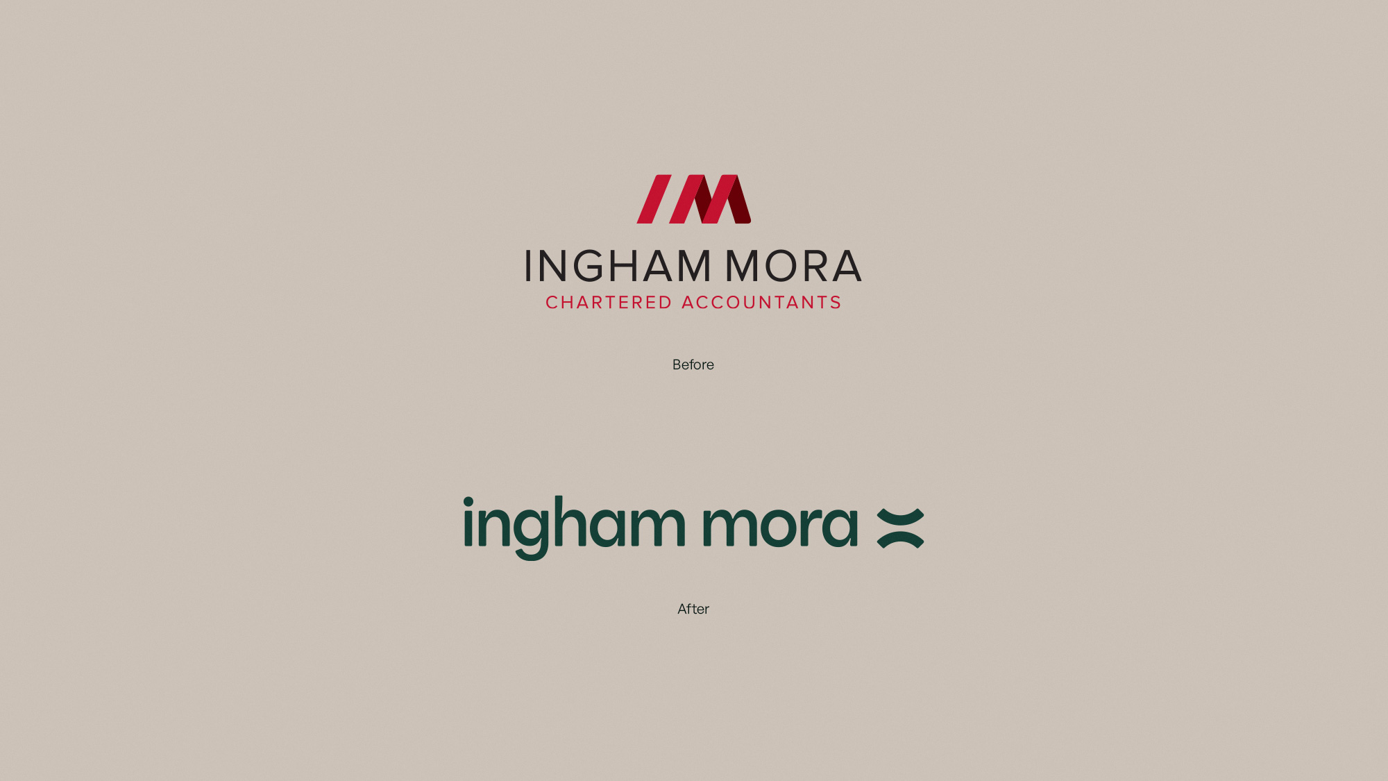
After more than 60 years in business, Ingham Mora had evolved well beyond the traditional accounting firm their old brand suggested. With a younger leadership team, a growing advisory focus, and a deeply personalised approach to clients, the business needed a brand that reflected where it was heading — not where it had been.
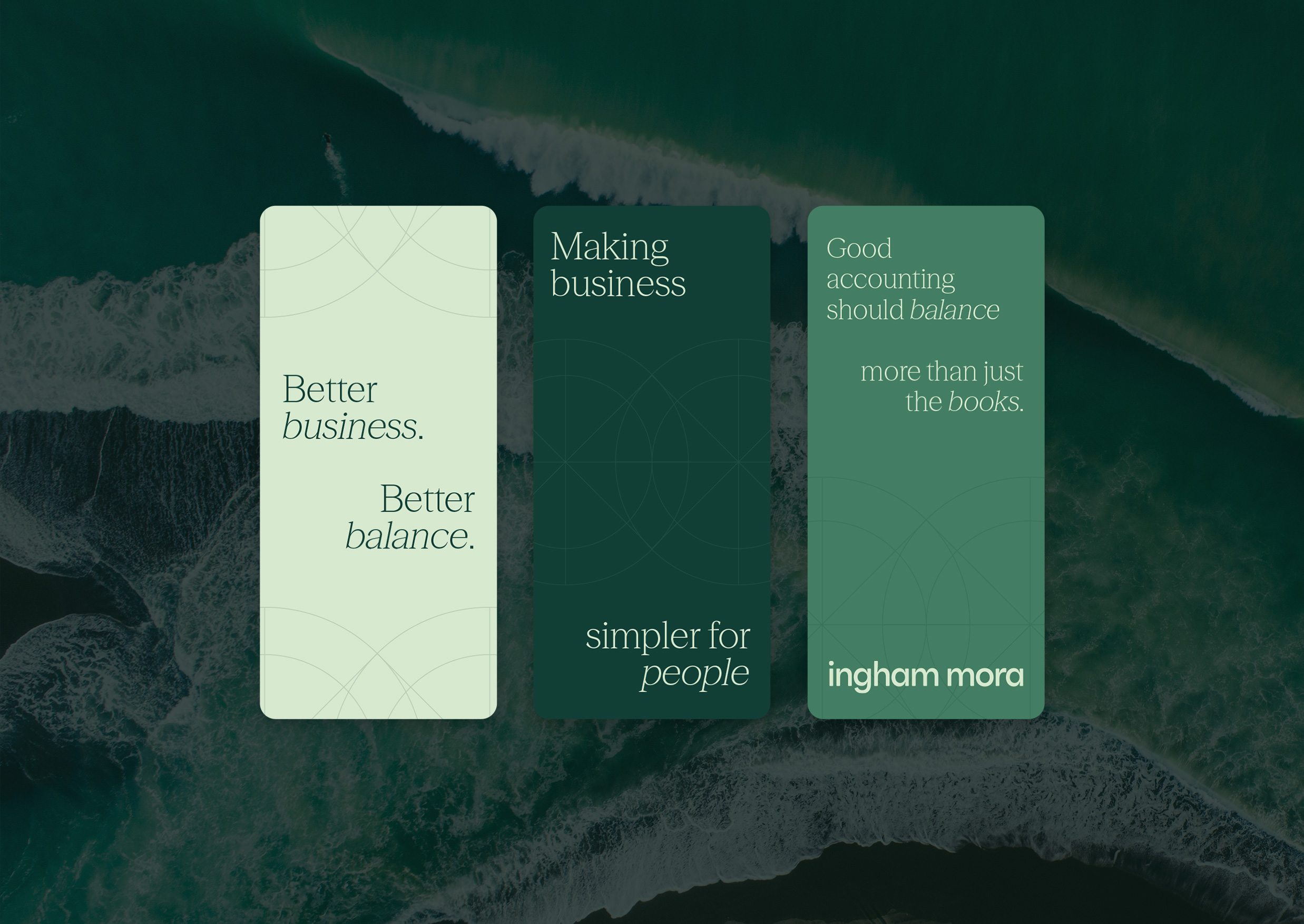
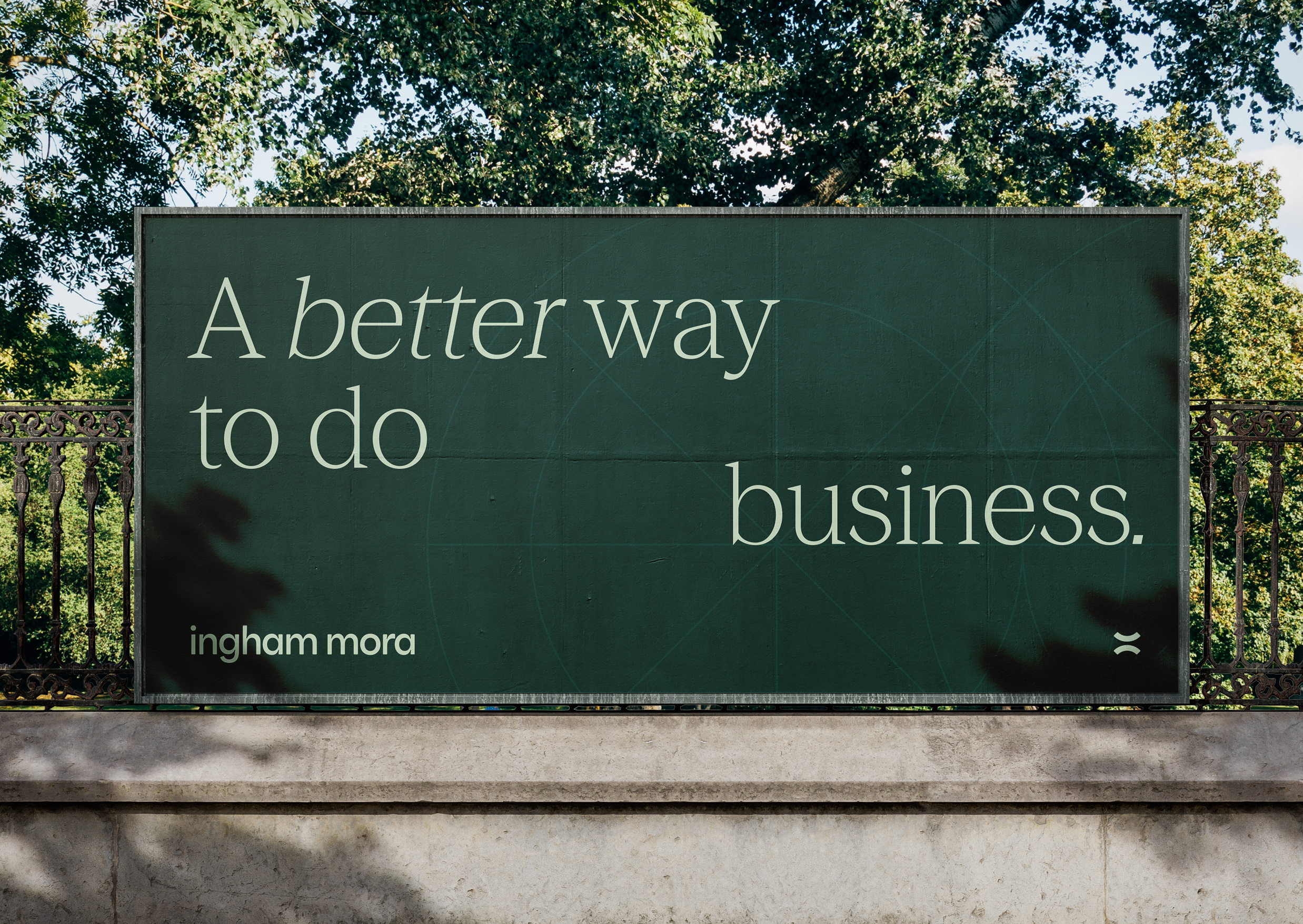
We partnered with the team to lead a full strategic rebrand, beginning with an extensive discovery process involving principals, staff, client feedback, competitor analysis, and future business planning. A recurring theme quickly emerged: balance. That insight became the foundation for the new positioning and tagline, Better business. Better balance.
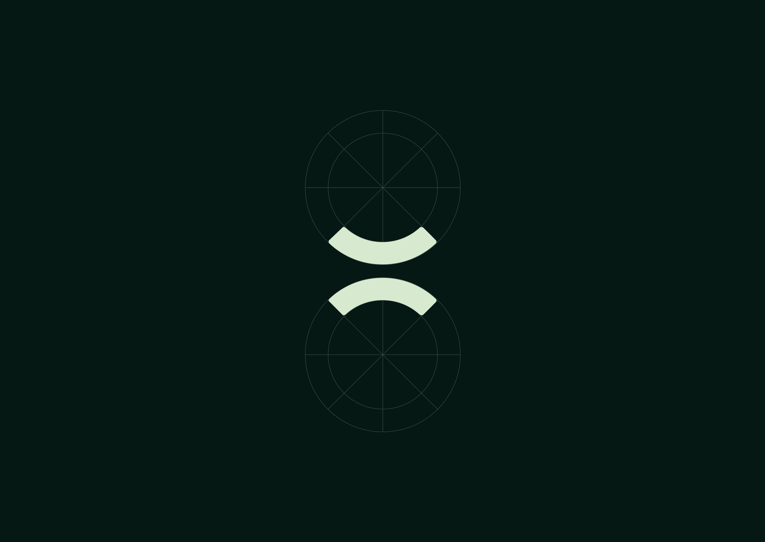
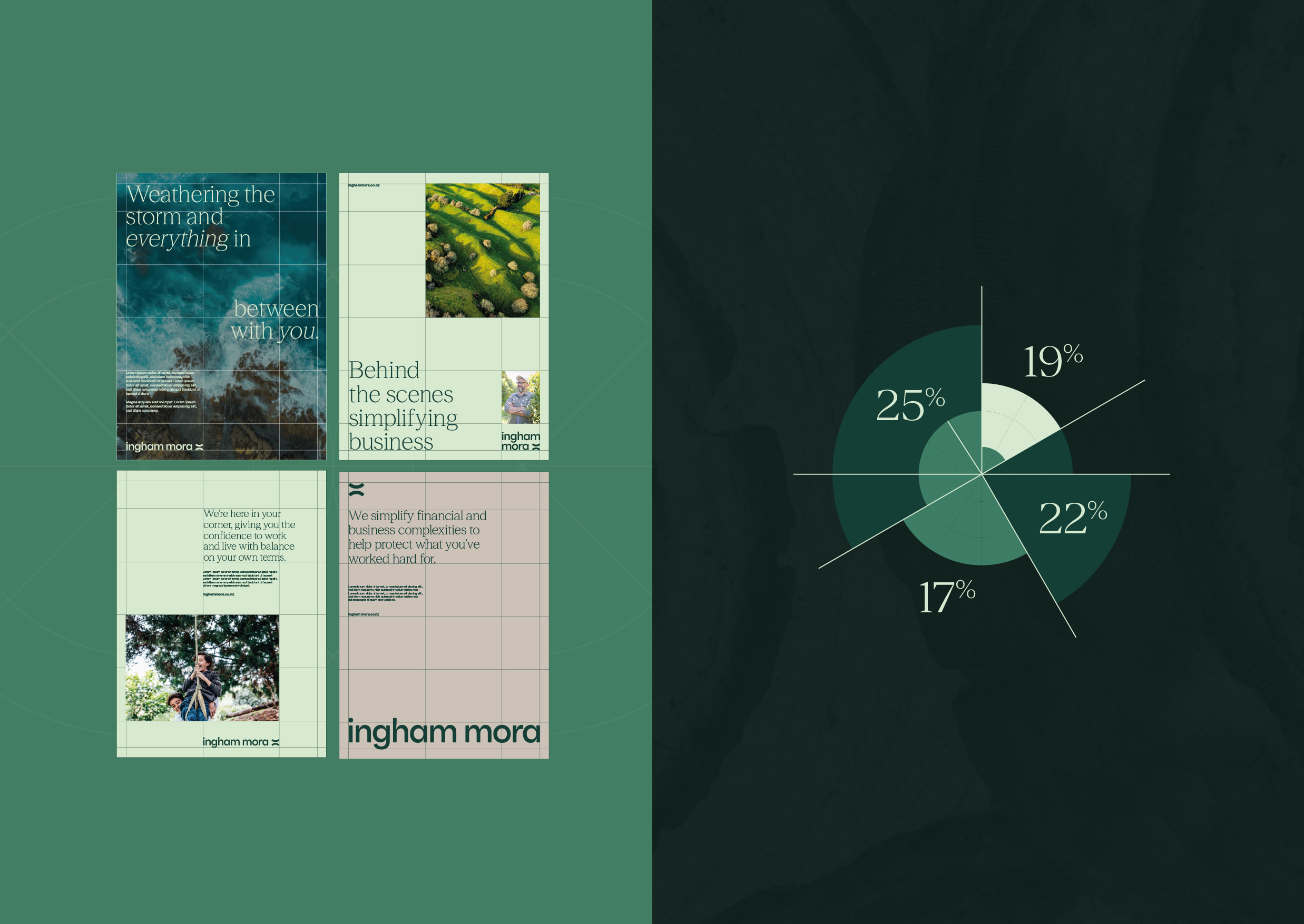
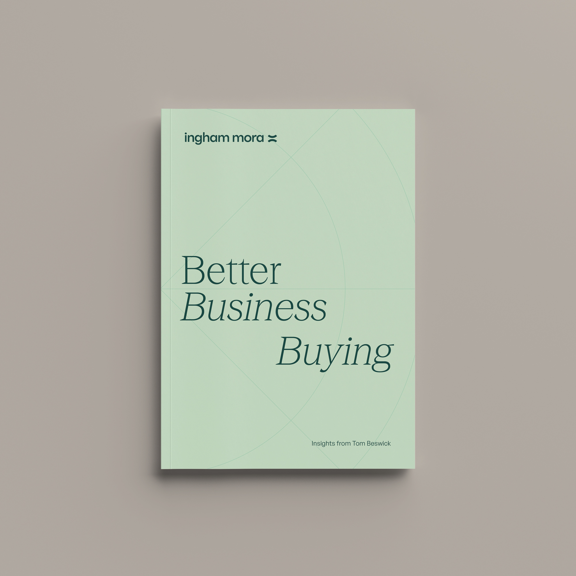
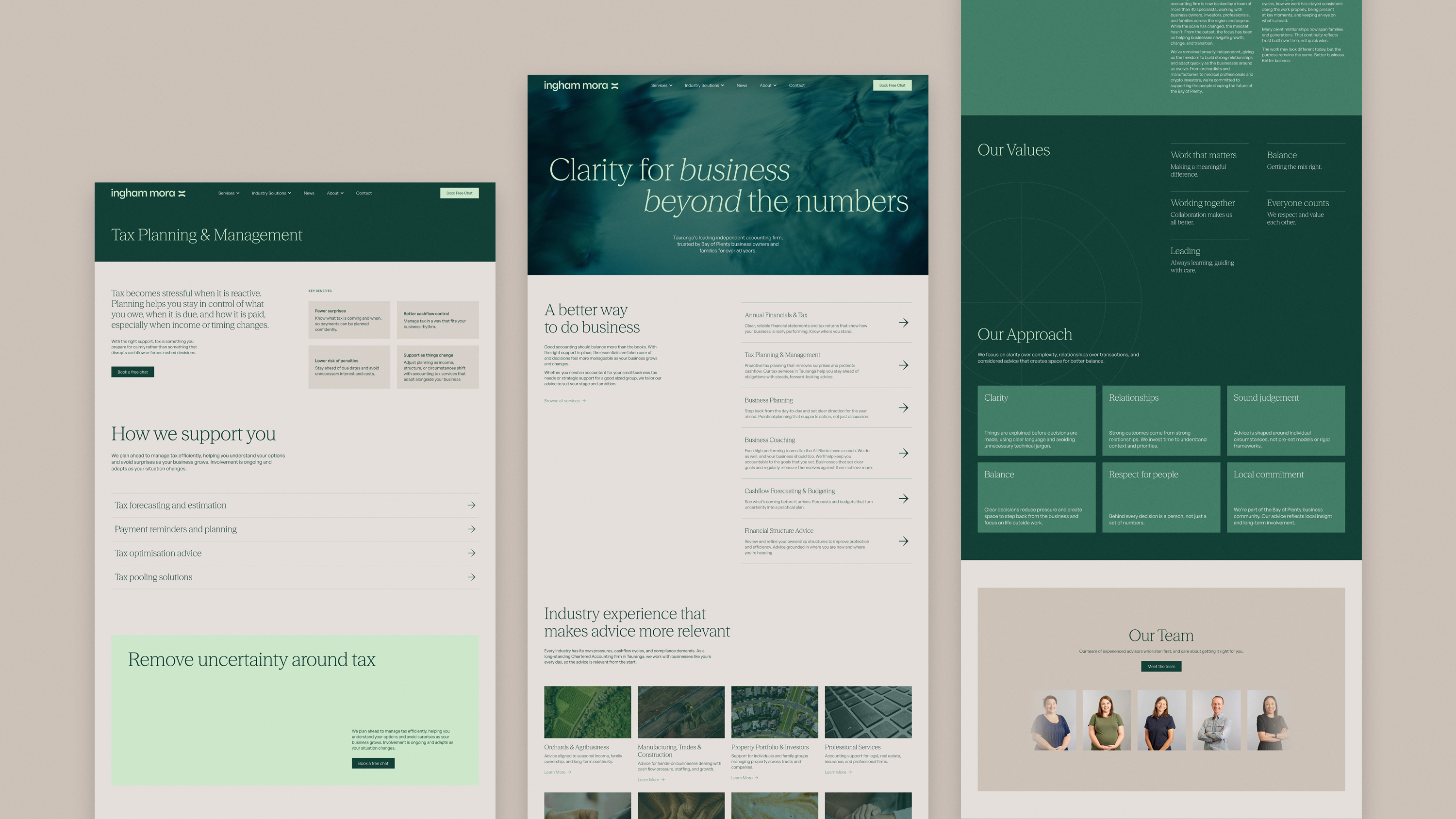
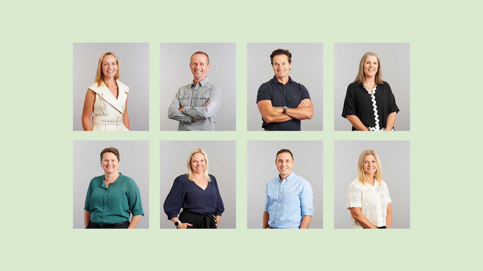
The new identity centred around a refined equals symbol, referencing both accountancy and the idea of balance in business and life. A softer green palette replaced the previous corporate reds, bringing a calmer, more approachable feel across every touchpoint. The rollout extended well beyond the logo, spanning signage, photography direction, vehicle graphics, social assets, templates, office interiors, and a completely rebuilt website experience tailored to key industries and client needs.
The result is a brand that feels clearer, more human, and far more aligned with the experience Ingham Mora already delivers. The new identity has strengthened internal alignment, sharpened market positioning, and better communicates the firm’s independent, advisory-led approach.