Formed by breaking away from a larger geotechnical firm, Geoplus is a standalone regional operator based in the Bay of Plenty. As a new entity, they needed to establish a distinct presence in a market dominated by conservative, corporate brands. The challenge was to reflect the team’s energy, personality, and more human way of working - without losing credibility in a technical field.
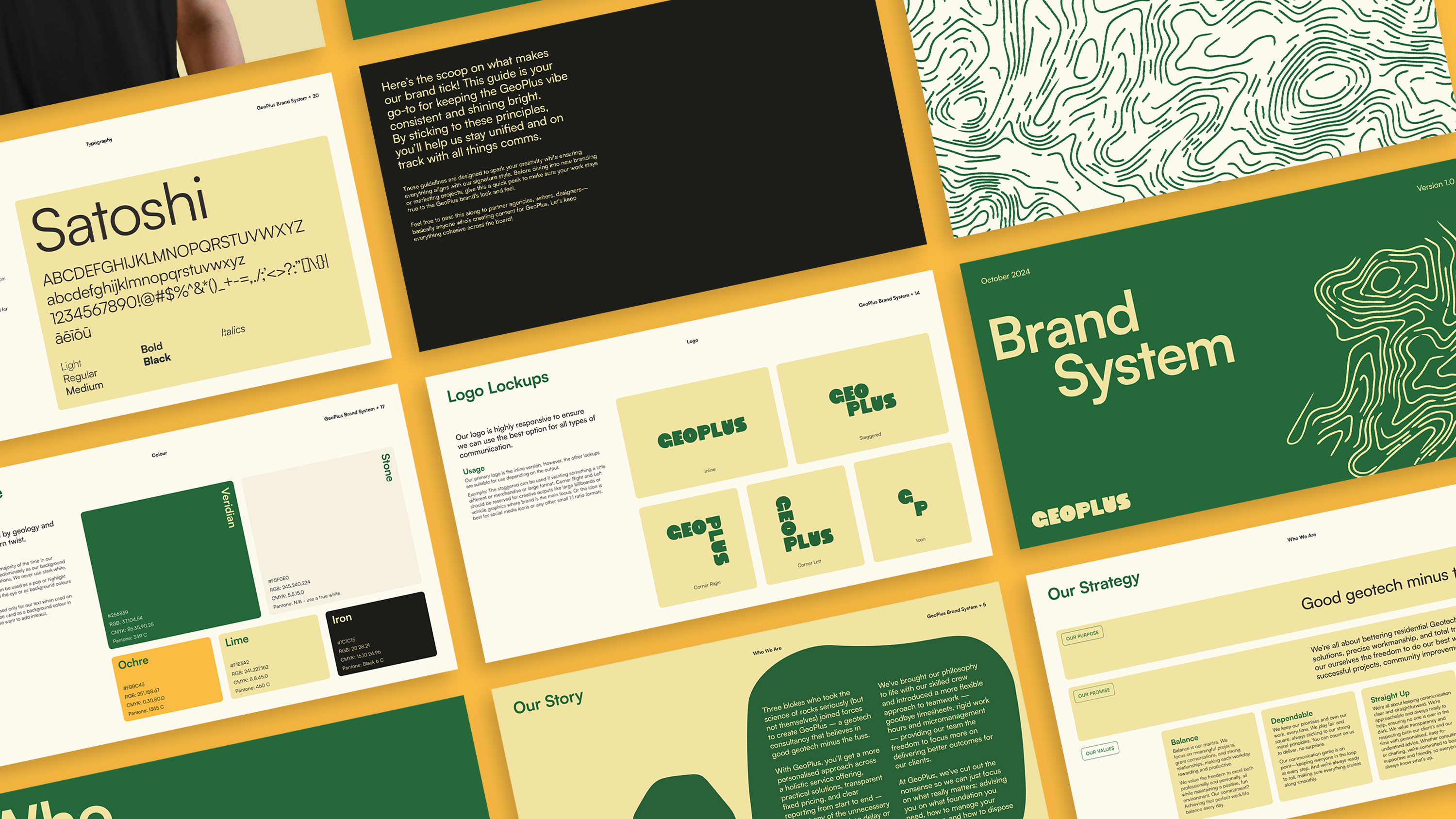
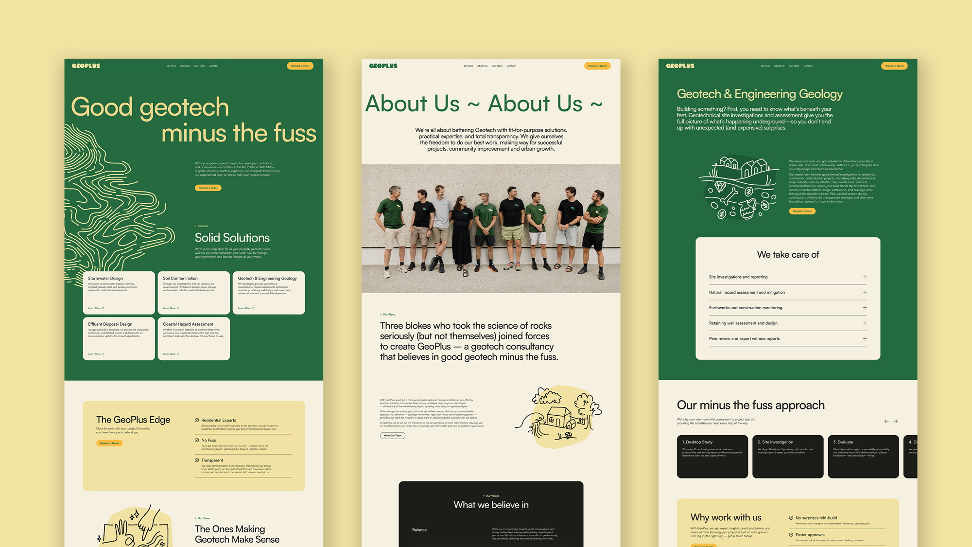
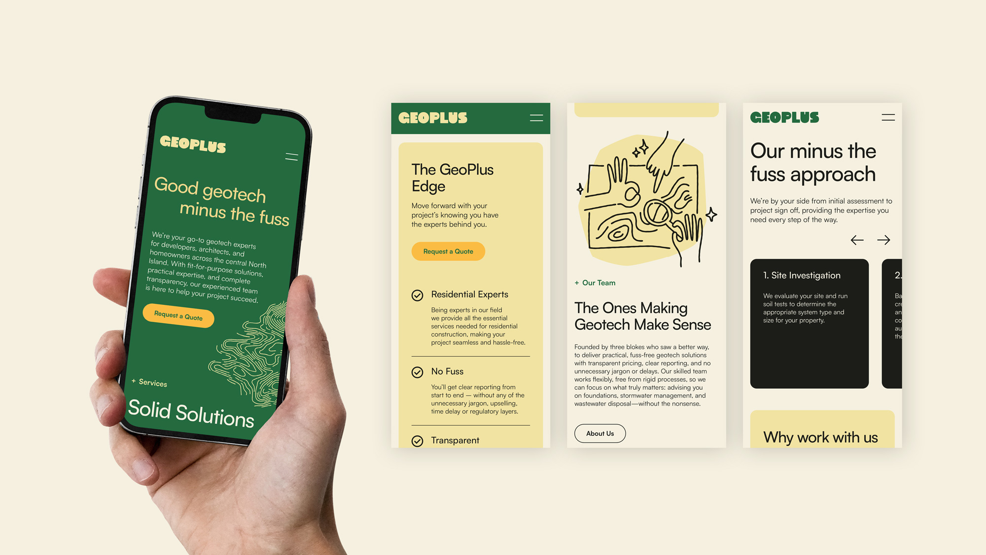
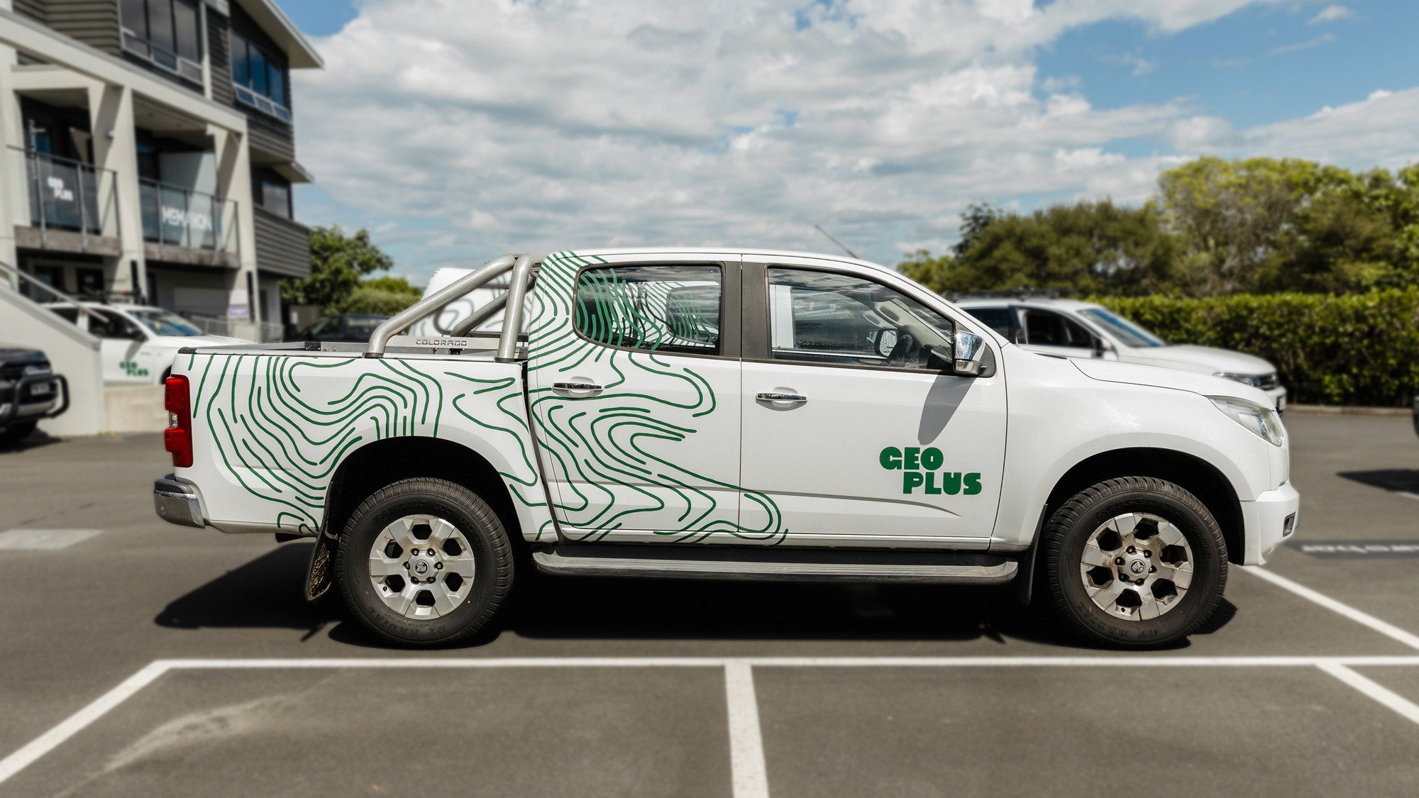
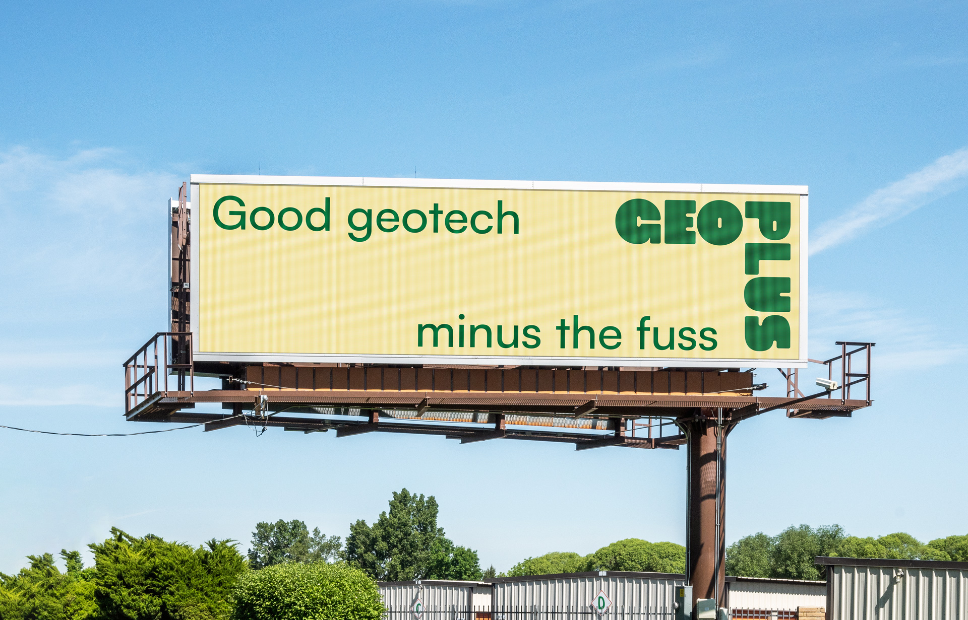
The strategic direction centred on differentiation through tone and visual identity. Rather than following the category’s typical blue, corporate aesthetic, we introduced a confident green palette to stand apart. The identity leaned into a playful, energetic tone, with a flexible logo system and hand-drawn illustration style to simplify complex ideas. This approach aligned with the brand’s “good geotech minus the fuss” philosophy - straightforward, practical, and easy going.
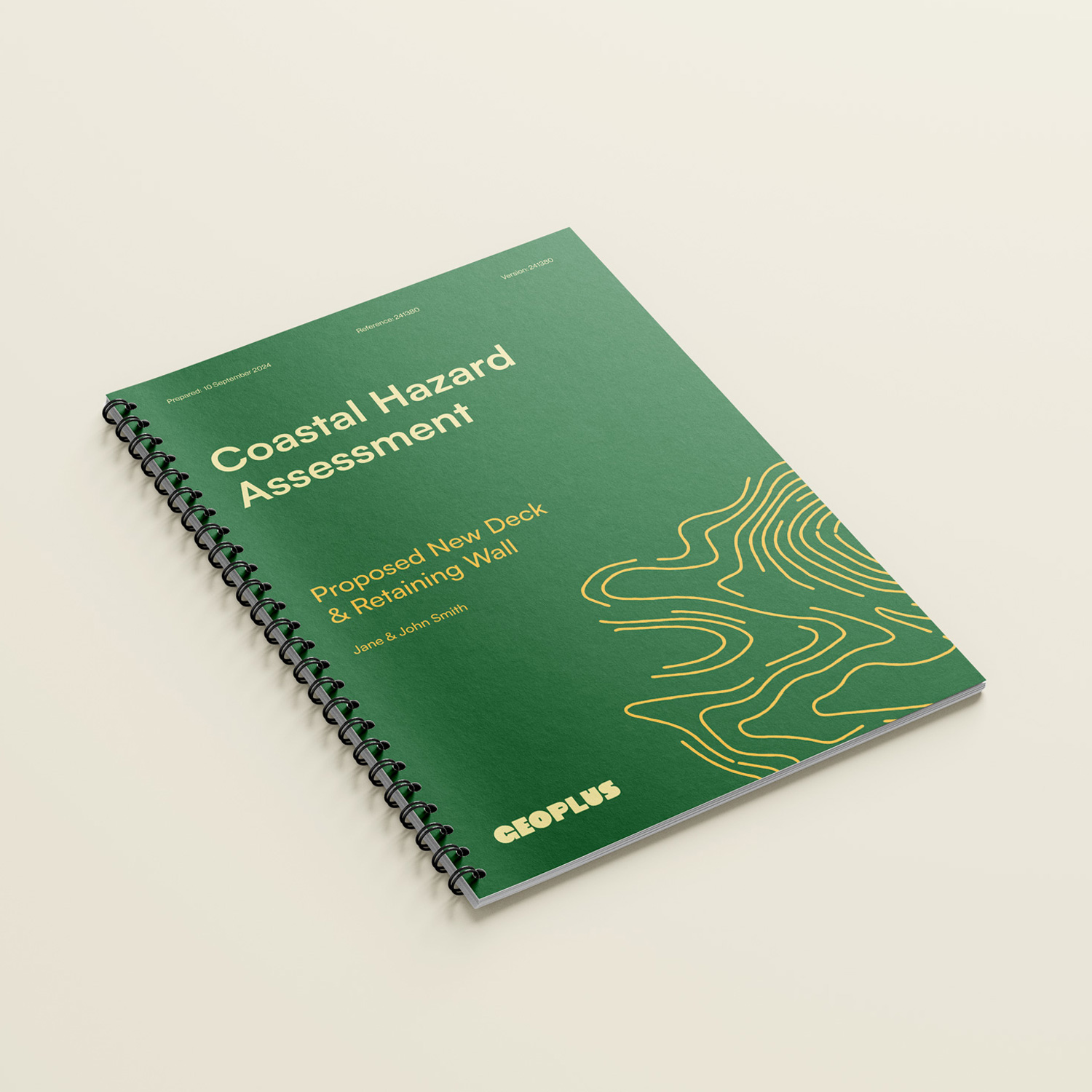
This thinking was carried across every touchpoint, from vehicle livery and business stationery to report templates and the website. Illustration became a core device, replacing literal site photography with more expressive, explanatory visuals. Topographical linework was used as a hero brand element, adding texture and consistency across applications.
The result is a brand that cuts through a crowded market. It better reflects the team behind the business and resonates with both clients and partners. The website has also supported stronger search visibility, helping Geoplus compete more effectively in their region.